
Quick Notes
Background: DocDoc, a healthcare platform startup, recently pivoted from being a provider paid service to an insurance paid service. In addition, they were looking to transition a disparate customer experience across three platforms into one unified experience.
Objective: Create a system of design patterns that are reusable and consistent across different stakeholder groups in a health insurance tech platform
Role: Visual and interaction designer
Time: 4 months
Process:
Competitive analysis
Information architecture
Navigational map
Sketching
Deliverables:
Sketch symbol library
High-fidelity mockups
Documentation
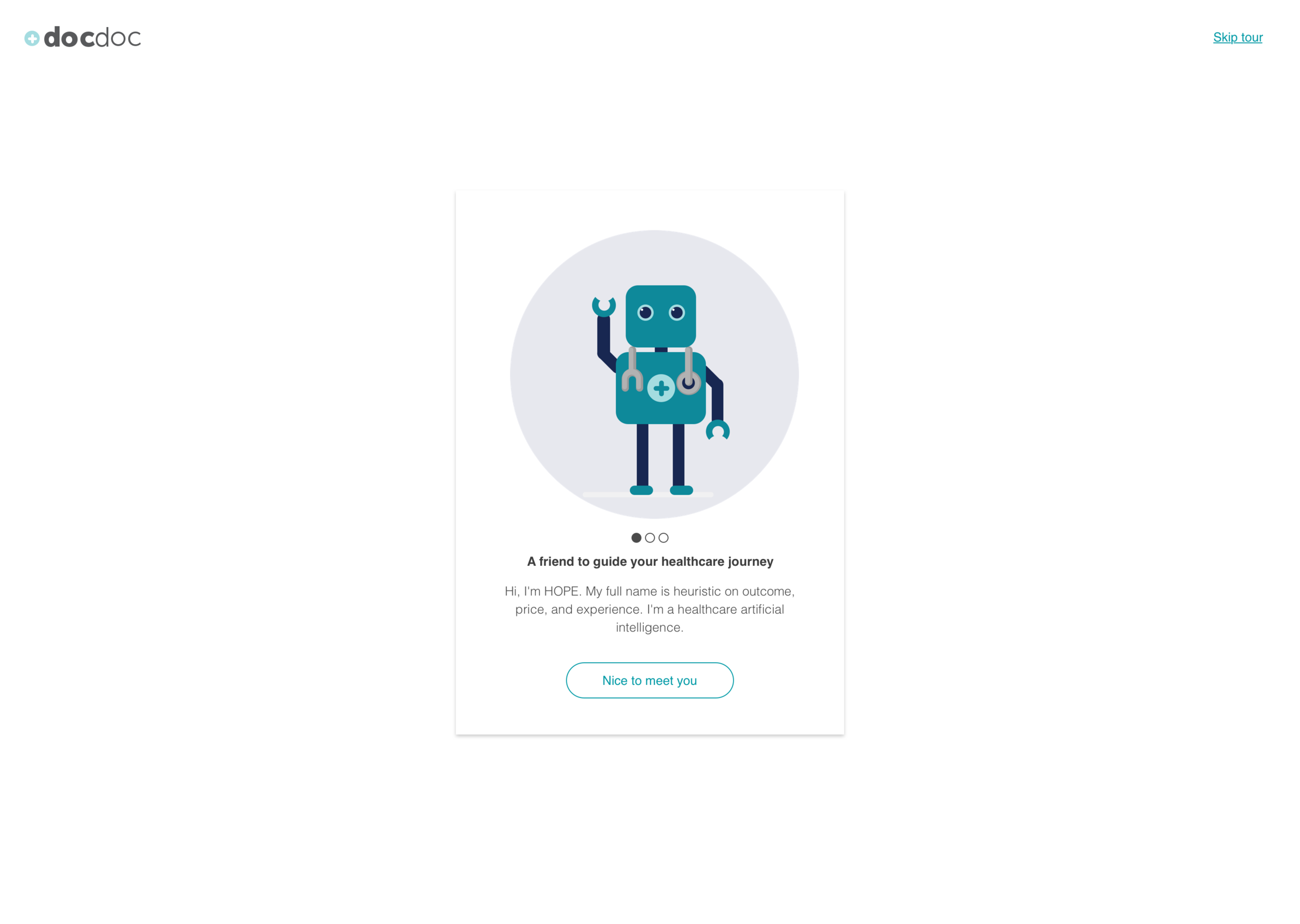
DocDoc is a platform that seeks to empower patients with descriptive and prescriptive analytics on providers that fit their needs and wants.

Screens that use our design framework
When I was brought onboard to DocDoc in 2017, the company had recently gone through a couple changes.
They refocused their core offerings from being a medical tourism service to a doctor discovery service.
They had also restructured their business model from being paid individually by providers to being paid directly by insurance companies.
In addition, years of technical and design debt had built up, which led to a very disparate experience for our doctors, patients, and medical concierge team.
The goals for this project were to:
Refine and unify the experiences of our consumer, provider, and internal stakeholders
Ensure that our service is easily extendable to add new features that may be requested by our new insurance partners.
Understanding the ecosystem
In order to understand the different facets of our users’ experience and the brand itself, I
went through the service as a customer looking for laser eye surgery
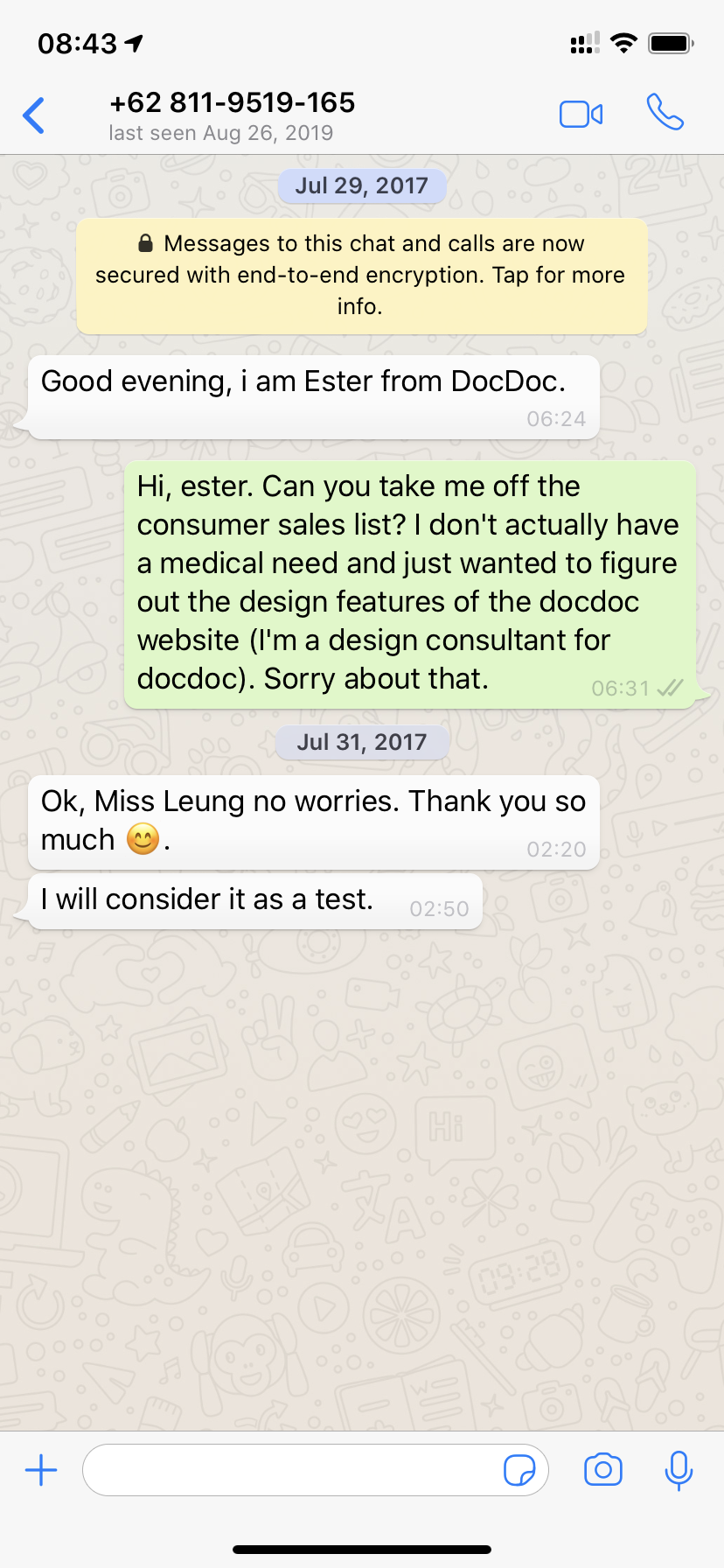
conducted a contextual inquiry of the consumer sales process
role played the provider in the sandbox environment of the provider portal
interviewed stakeholders about their view of the brand and their company vision

Pulling everything together
Higher level view
After talking to primary stakeholders to get a sense of each of the features they wanted for this platform, I drew up a service blueprint to guide our understanding.

From this, I diagrammed out what would be the functions of each role and categorized them as schemas.
For the consumer group, they were primarily concerned with checking appointments and finding a suitable doctor.
For the provider group, they wanted to update their profile and link affiliated providers, as well as view their appointments.
For the more administrative roles (concierges, administrators, and insurance), they wanted a higher level view of the whole database and the ability to dive deeper.
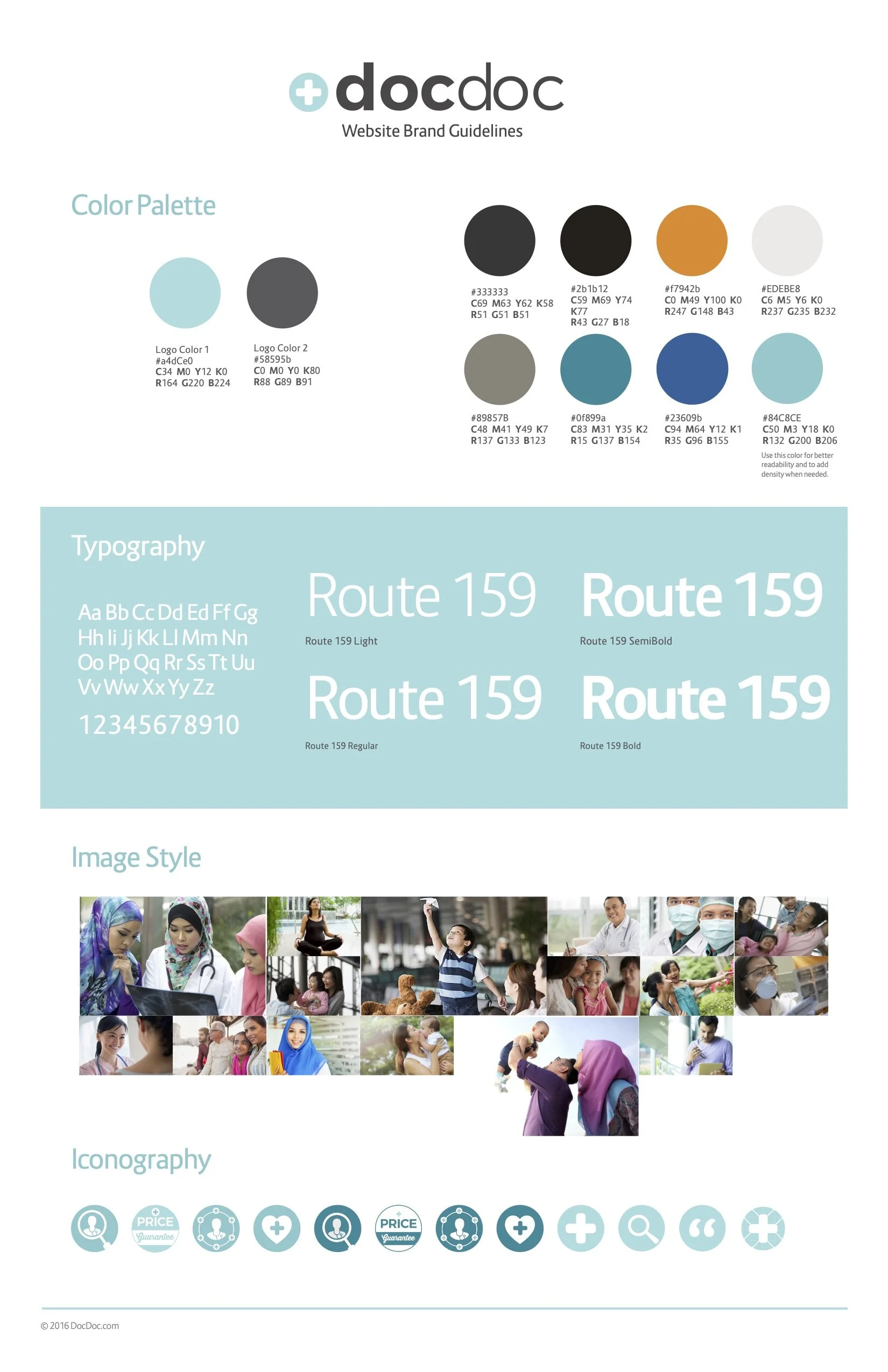
I looked at products that dealt with similar actions to see how they solved their respective problems.
Lower level view
Once we nailed the higher level specifics, I dove deeper into individual functions and drew up a rough site flow for each of the roles.
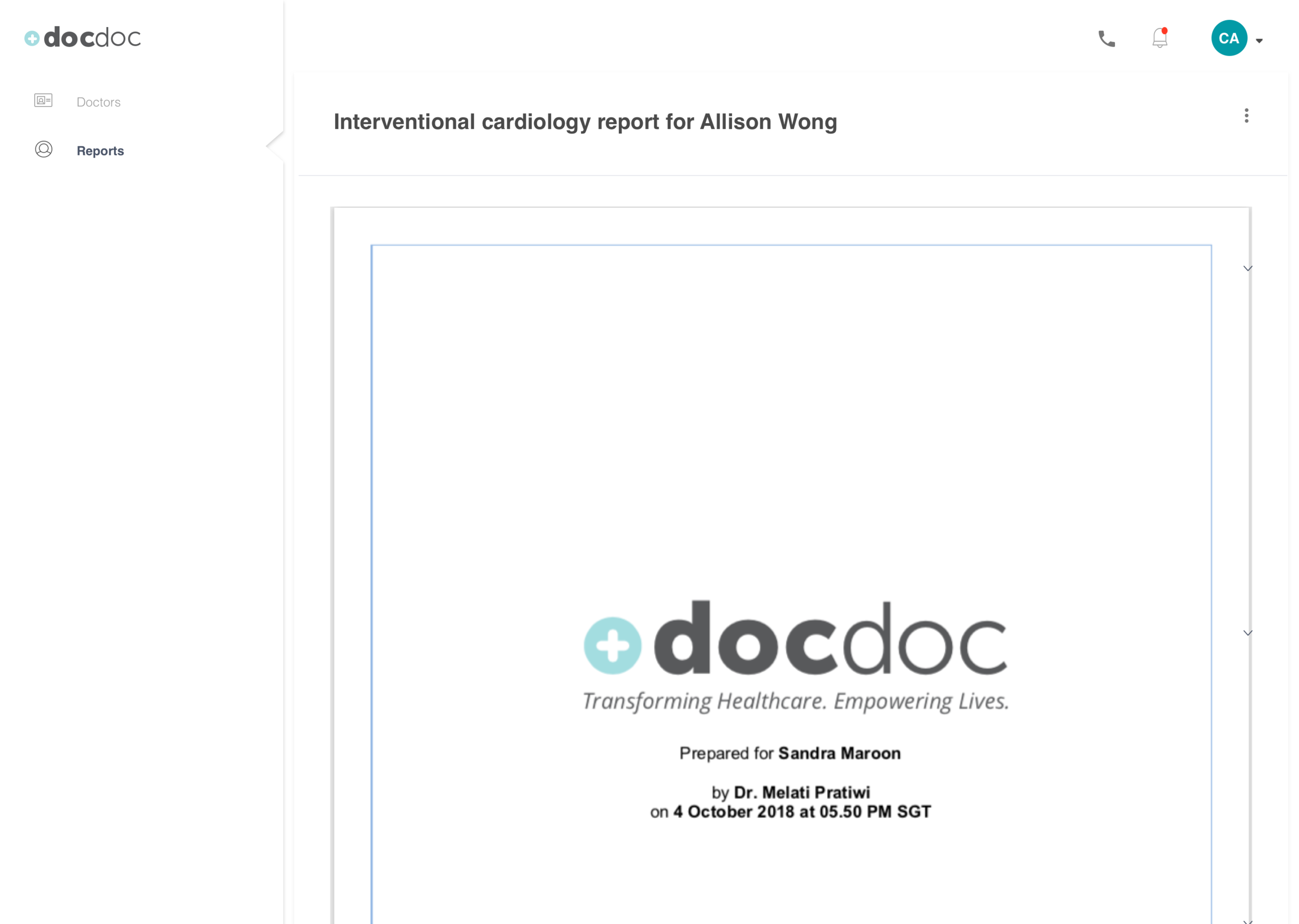
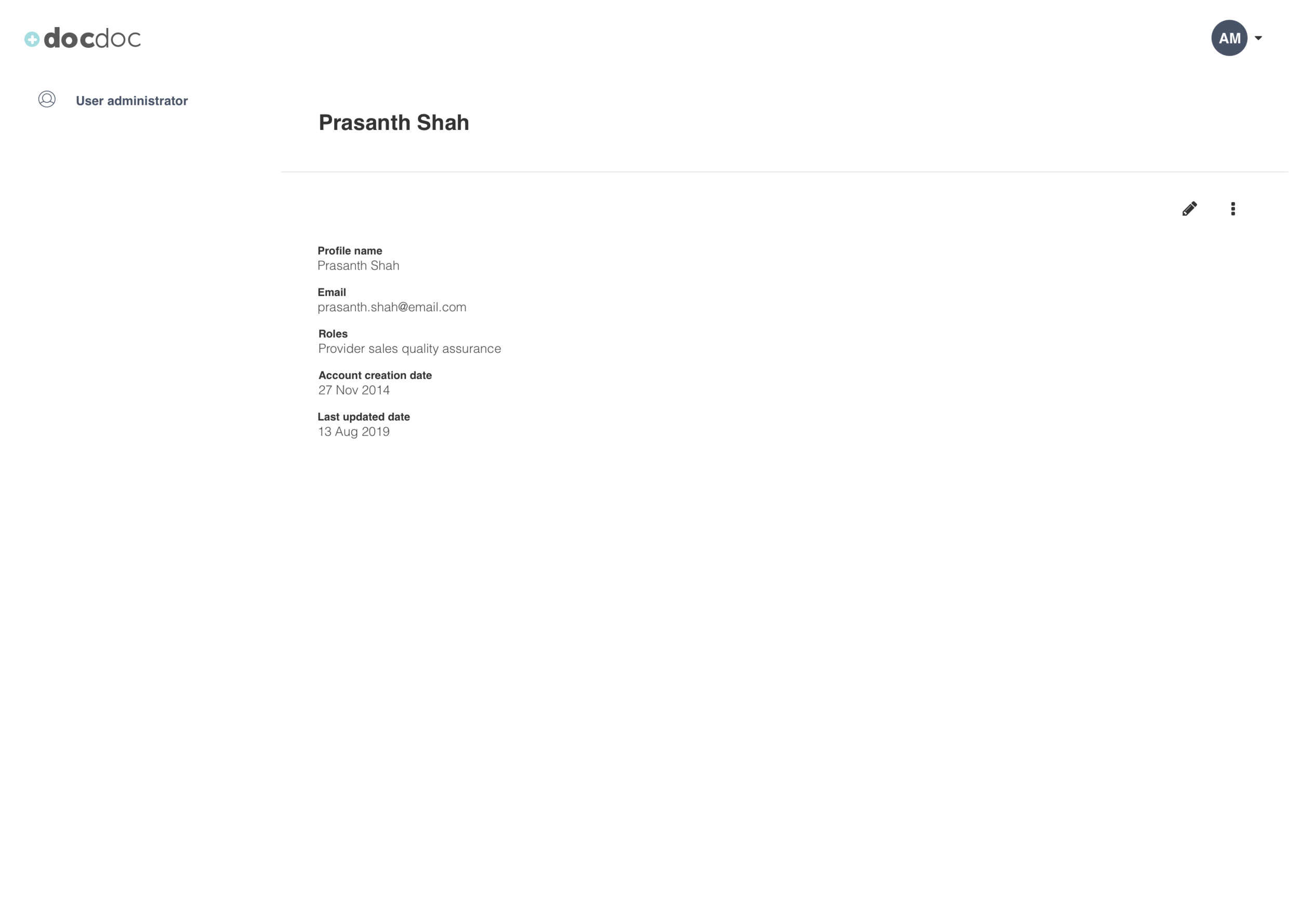
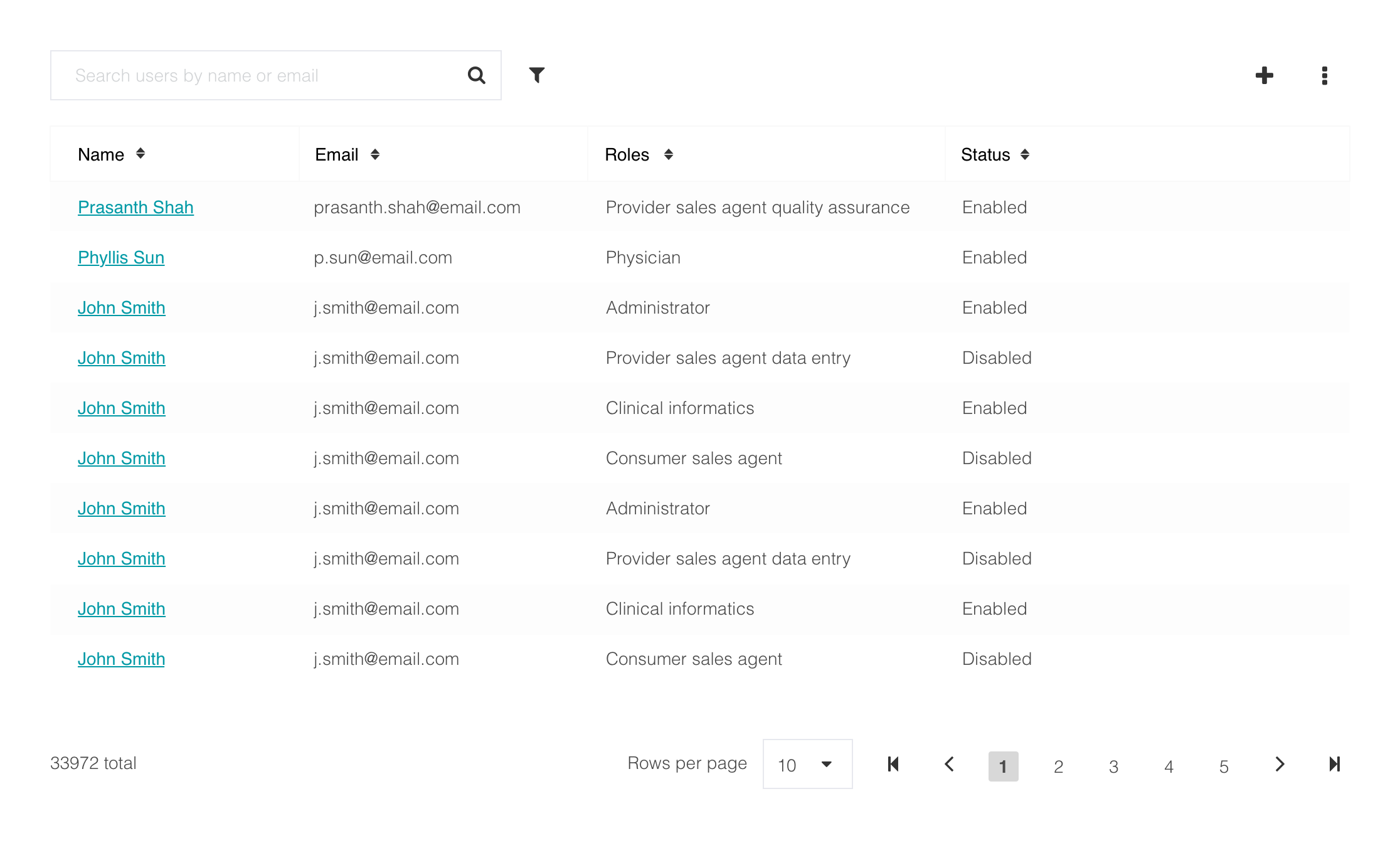
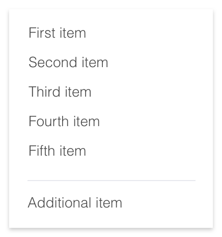
For each of these flows, there were several types of pages in common. For instance, a consumer and a physician would both look at a data table of dates on their appointments and bookings pages respectively. Other common pages include sign up forms, modals, drilldowns, filters, etc. Once the template was built, I could quickly create a prototype for a feature to quickly test with end users and stakeholders.
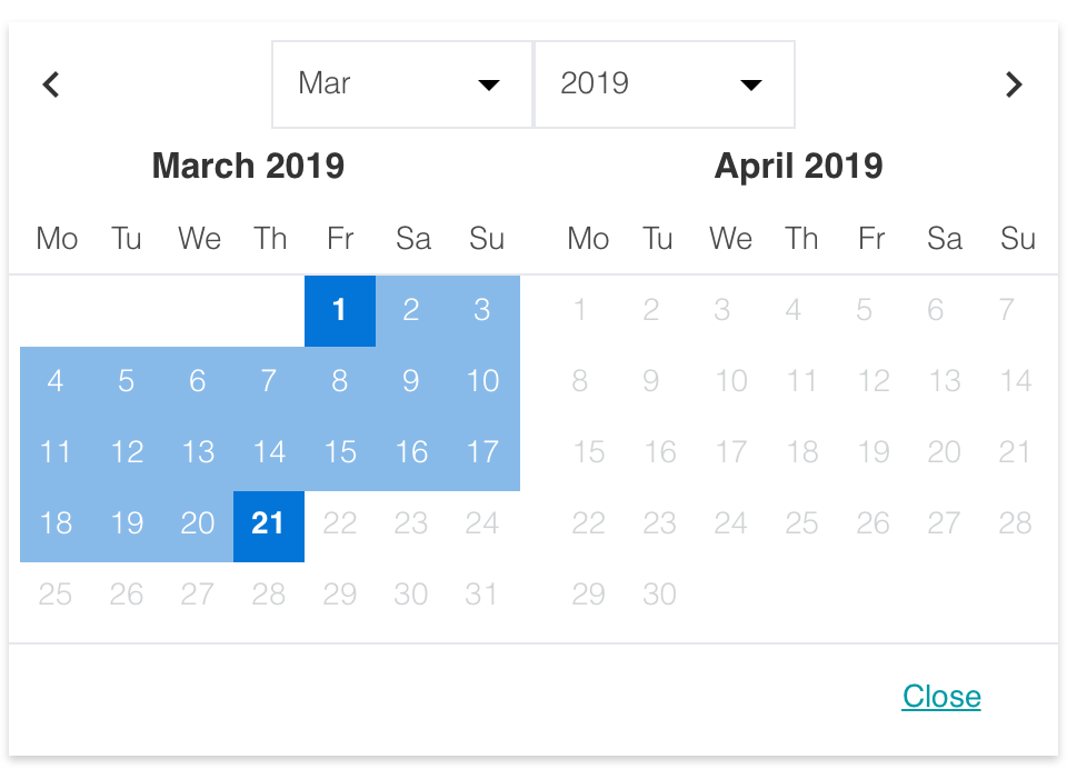
Template Framework for common user tasks
Based on the service blueprint, user flows, and functional specifications that I drew up with stakeholders, I was able to compile a list of common patterns that repeated itself across the system in all roles. Here are some of the basic building blocks:
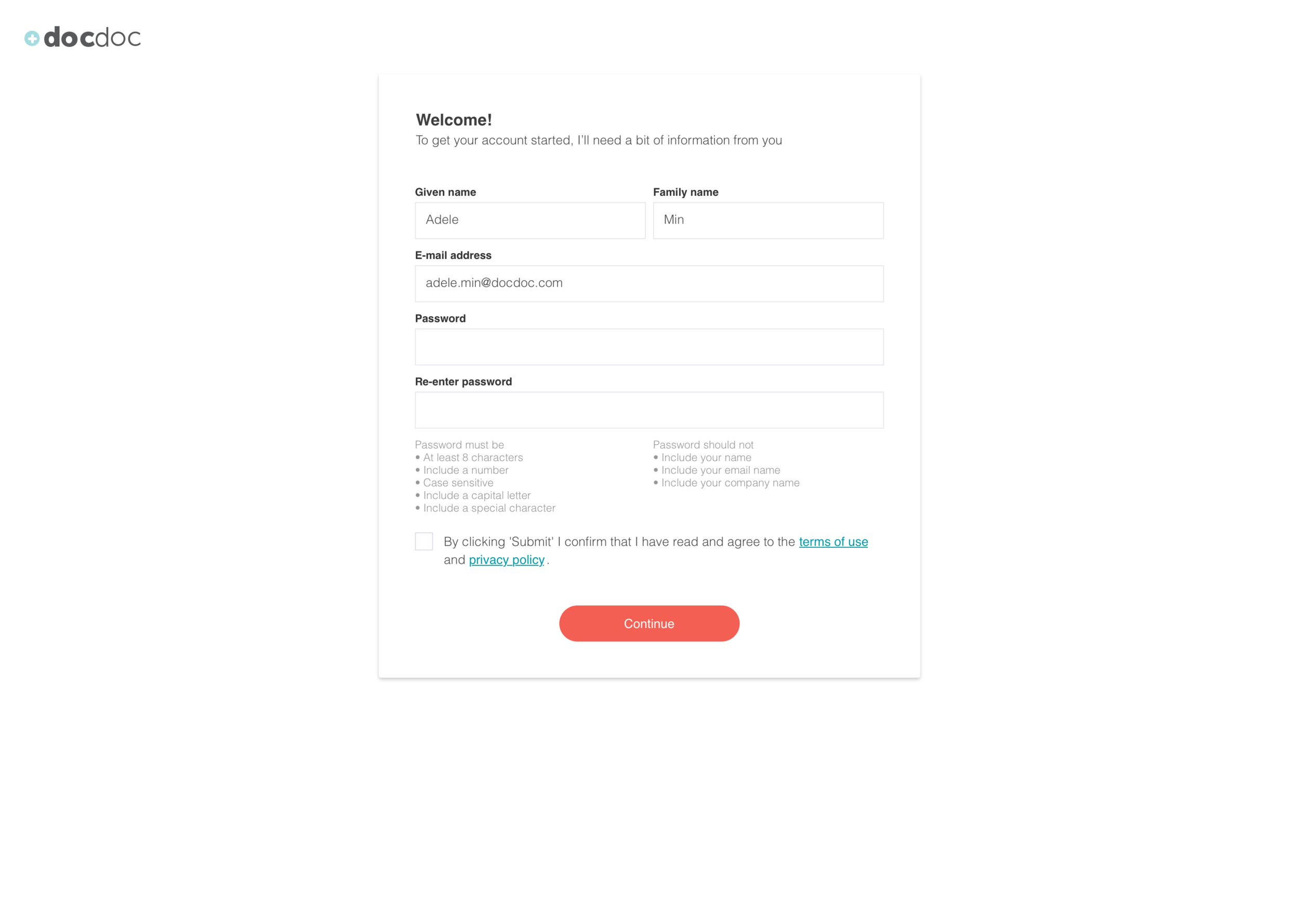

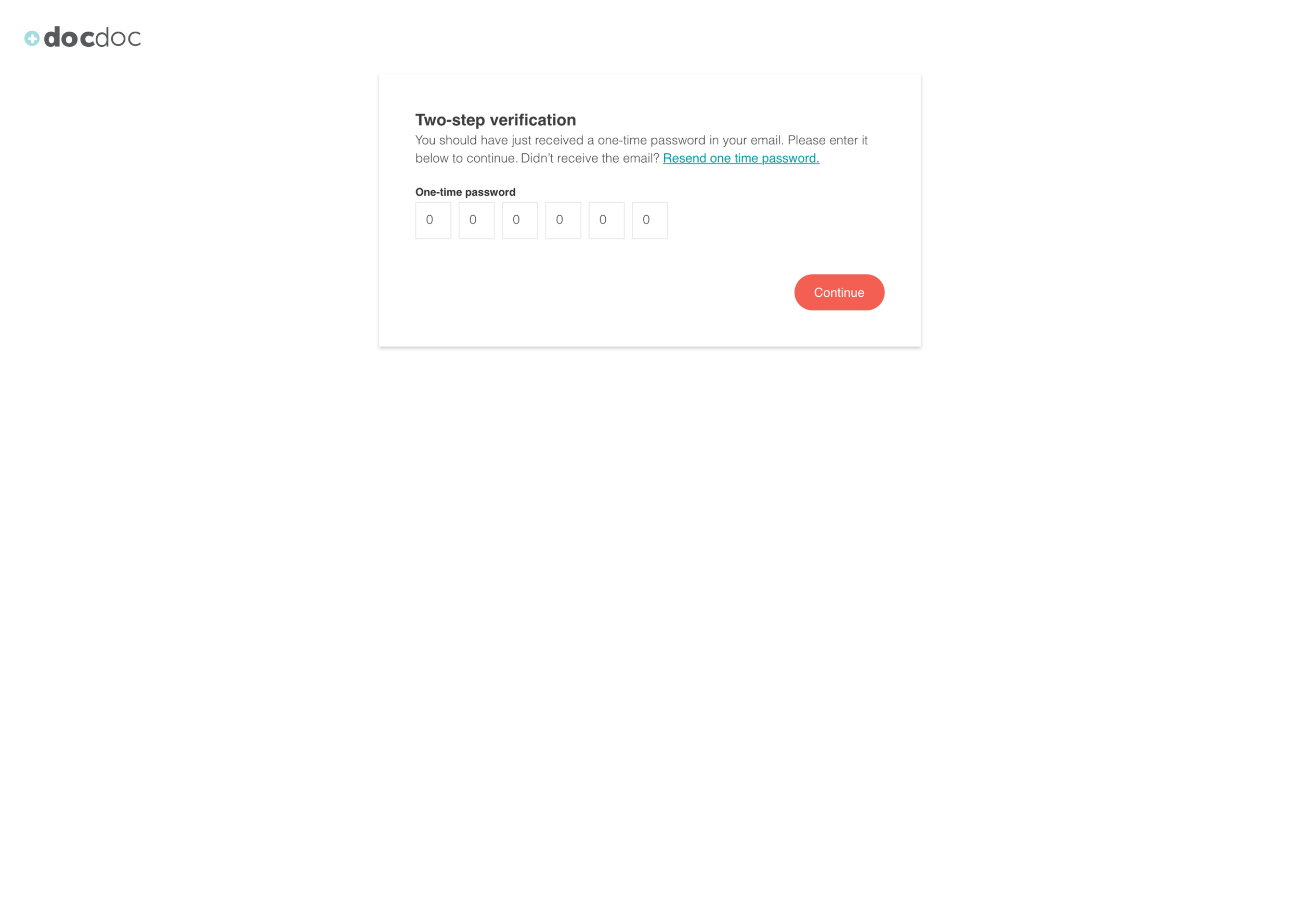


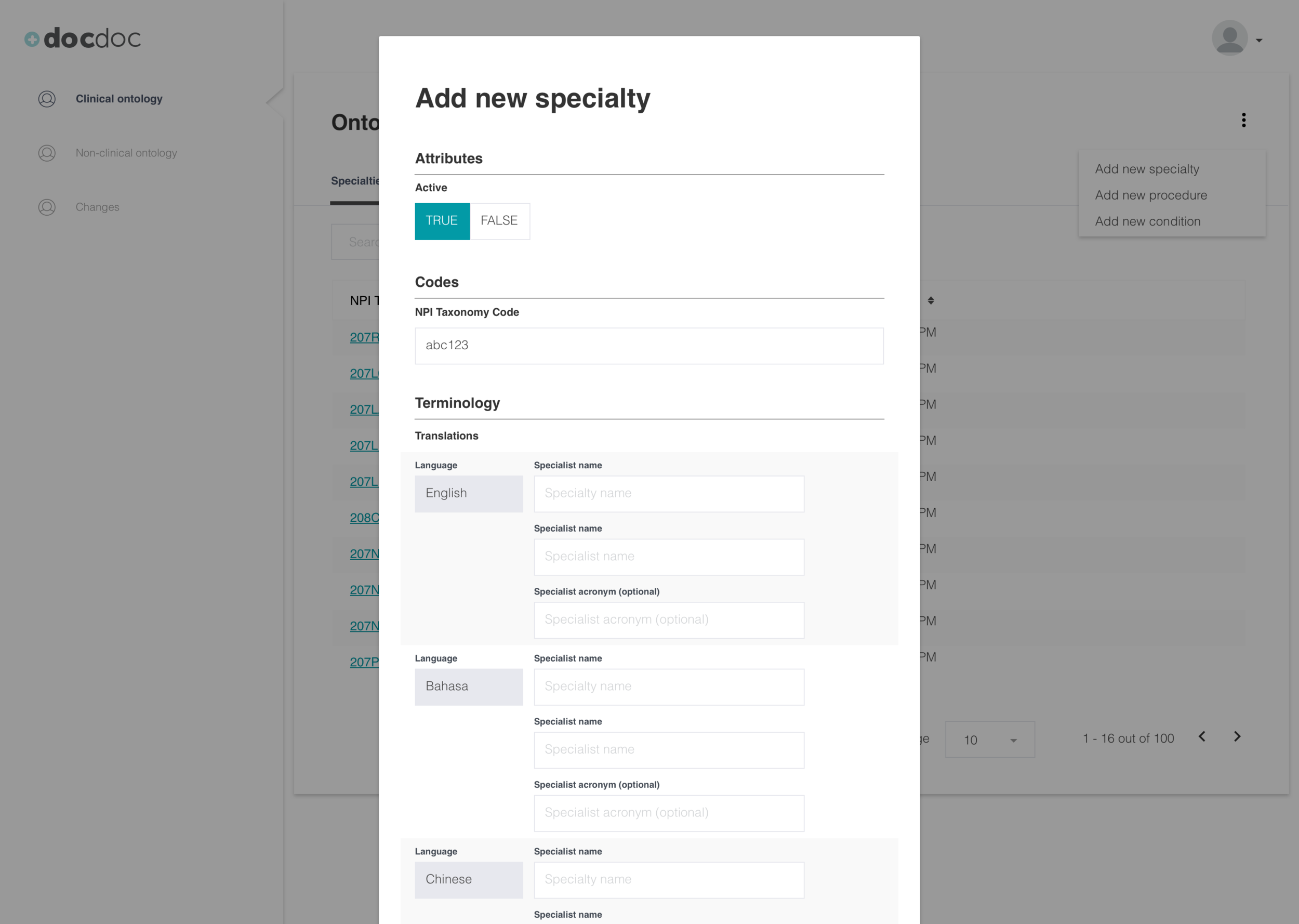
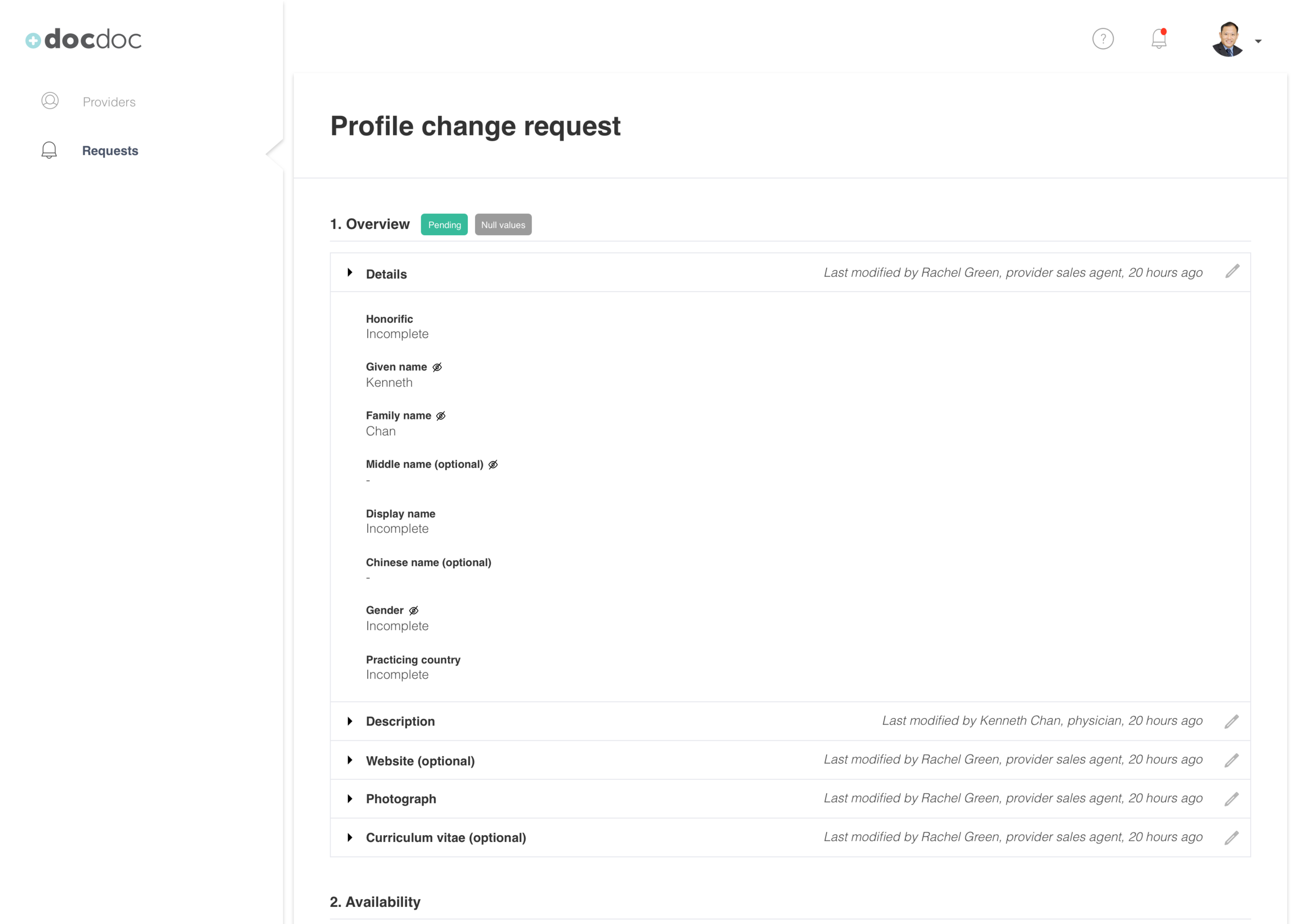
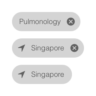
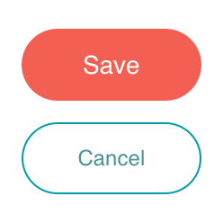
These templates not only included a standardized format but also standardized components between them for a more consistent experience. A datepicker for a doctor is the same as the datepicker for a consumer. Here are a few examples of components:


Results
A cleaner, extendible framework - These templates based on needed features for our users are consistent and were extended for additional roles and features requested by our insurance partners.
Acceleration of the design timeline - High fidelity prototypes could be created in half the time (ex. the 216 mockups for the provider sales role took 2 weeks to create instead of a month)
Increase in engineering capacity - Engineering was able to devote fewer points to create features because of this framework and the functional specifications.