
Quick Notes
Background: DocDoc is a company that provides access to quality doctors in Asia.
Objective: Do a quick revamp of the existing website to clean up hierarchy, update content, and align the style to match that of the new internal product and our insurance partners.
Role: Designer
Time: 1 month
Process:
Heuristic evaluation
Branding guideline
Design systems
High-fidelity mockups
Deliverables:
Branding guidelines
Boilerplate HTML/CSS
Sketch file
Invision mockups
DocDoc is a platform that seeks to empower patients with descriptive and prescriptive analytics on providers that fit their needs and wants.
When I came onboard to DocDoc, the website was in need of a refresh. There were several changes to the business at the time, and the design debt had built up. The company had recently decided to pivot away from being a medical tourism site and also pivot from a doctor paid service to an insurance paid service. Since the website had been created by a consulting group, a lot of the language hadn’t been updated, and there were some hierarchy issues as well.
Our goals were:
Align our brand with our new insurance company partnership model
Quickly fix any lingering critical technical and design debt
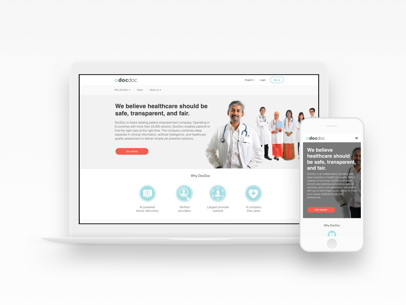
The final revamped website
Research
Understanding the brand and website historically and organically
In order to understand the brand historically, I dug up old marketing material and consulting documents from when a consulting group had built the first iteration of our site. I also interviewed key stakeholders and co-workers about the current state of the website as well as their impressions of the DocDoc brand. In order to find specific problem areas, I conducted a heuristic evaluation of the site content and flow according to Nielsen’s 10 Usability Heuristics.
Creating a plan of attack
From this initial research, I laid out brand guidelines which included cleaned up marketing messaging and style guidelines for online and marketing materials. Along with key stakeholders, I iterated several times.
I also identified the most crucial parts of the website that needed to be fixed:
Inconsistent hierarchy and colors
Too many headings and footers
Inconsistent messaging for the brand throughout the website
Prototyping
Refined look and feel
The initial version of the site had inconsistent typographic hierarchy from page to page. In addition, the color palette had been changed several times, but there were still some site elements that used previous colors.
I went through all the key pages and made mockups of them with cleaned up typographic hierarchy and also with the new color palette which had been agreed on with stakeholders.
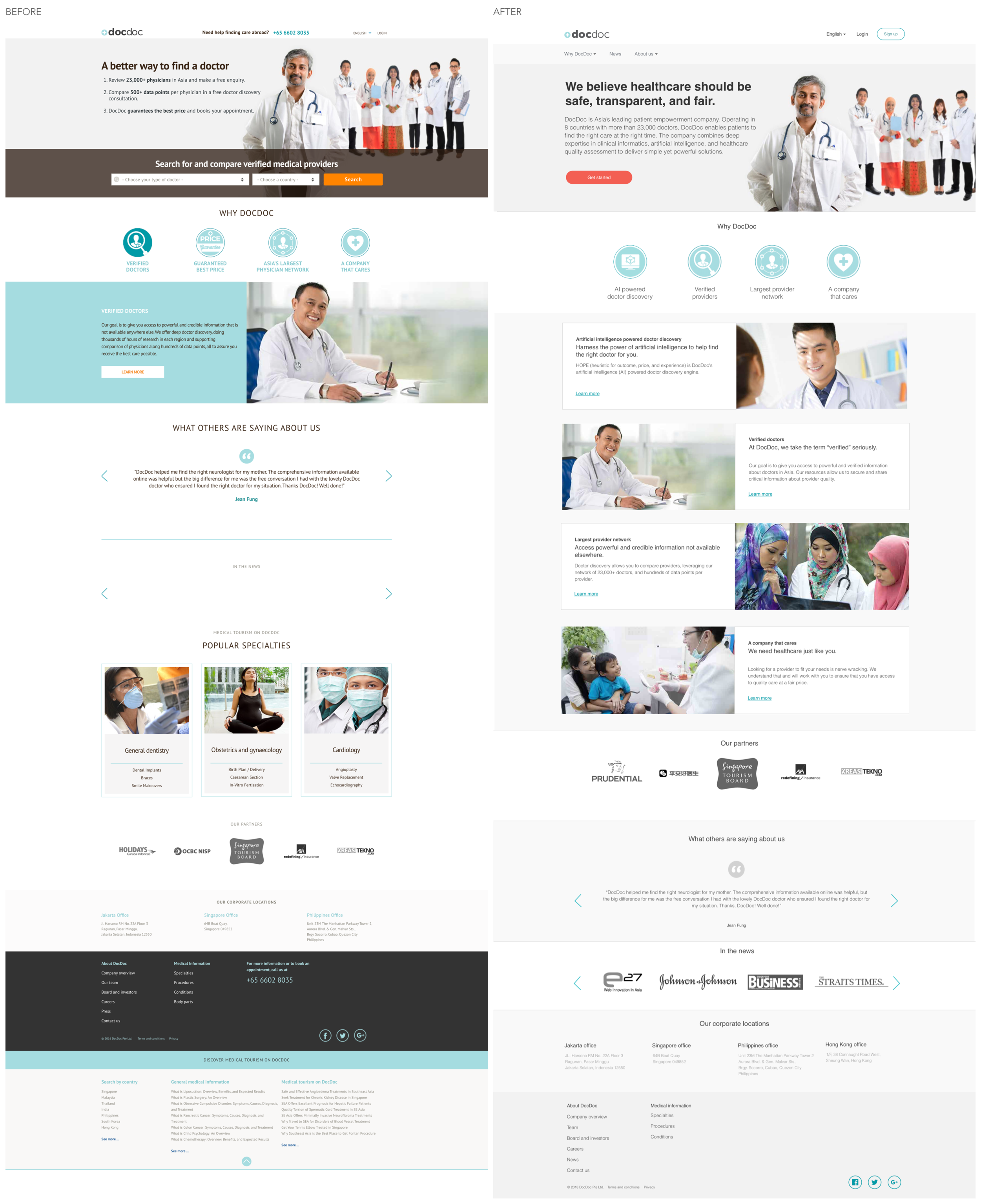
Simplified site map
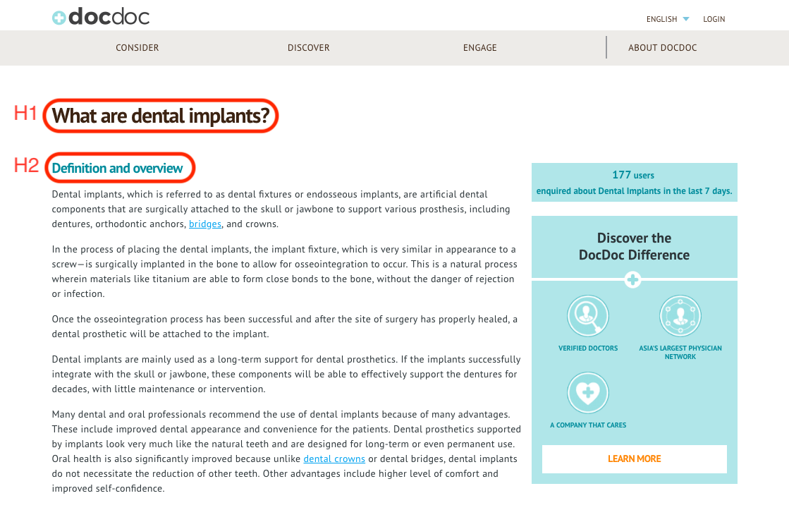
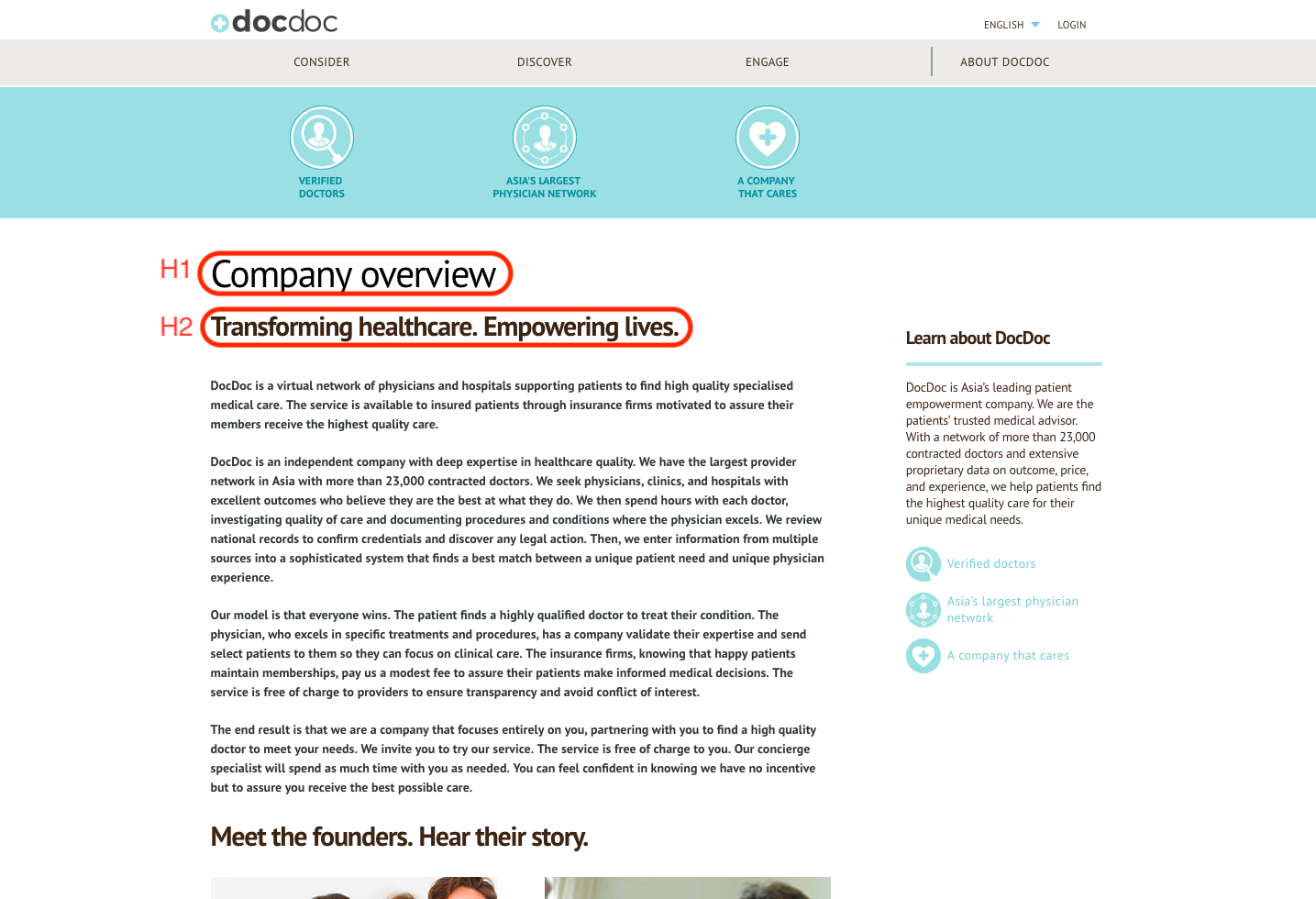
The previous site had a confusing hierarchy where there were two headers that did different jobs. The first header was more medical tourism focused and walked you through three steps (consider, discover, and engage). It also threw the About DocDoc page in for good measure. The second header listed out the four value propositions that DocDoc offers.
I took out the first header, since it was mostly there to direct people to our medical tourism service, which was no longer a company focus. I put the value propositions into a dropdown menu for the one header that was there, pulled out the press page as its own item on consulting with marketing, and then put the remaining about pages in a dropdown menu.
There was also a persistent sidebar with the value proposition that had the same content as the header that was on every page. This overcomplicated the page and made it hard for someone to know where to focus.
Before and after of the company overview page with and without the headers and sidebar
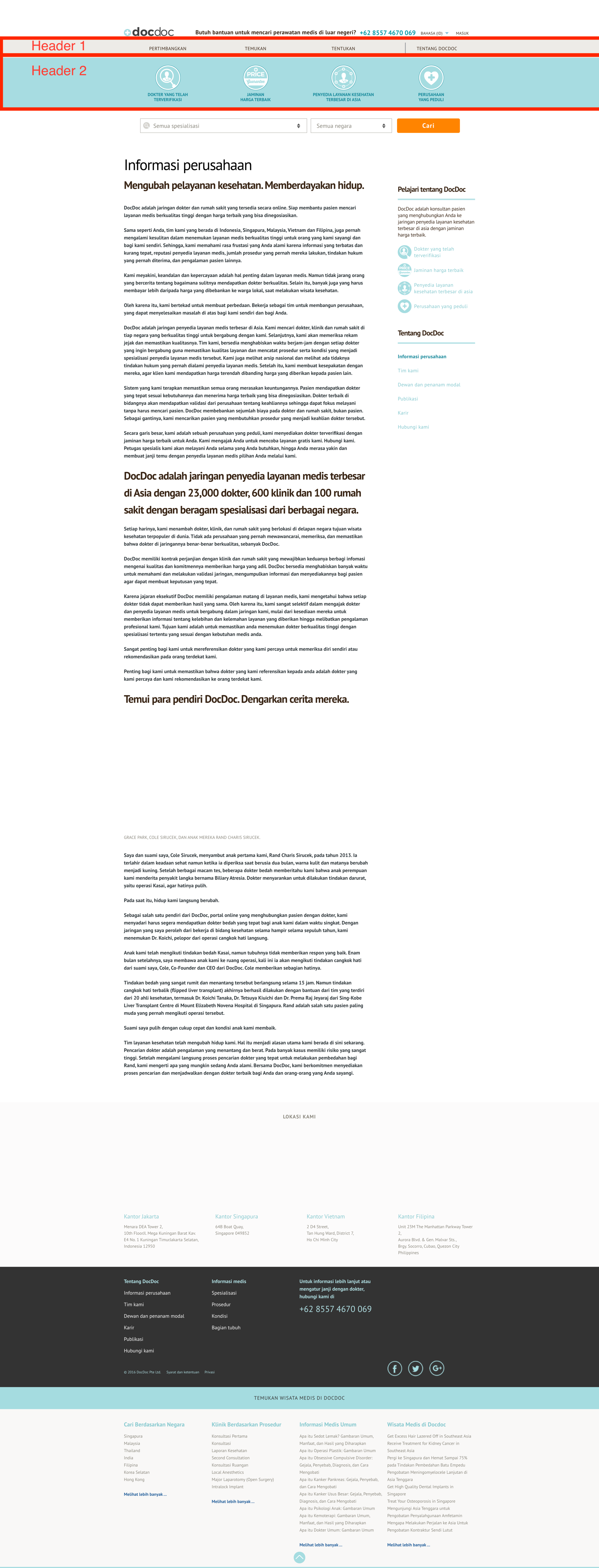
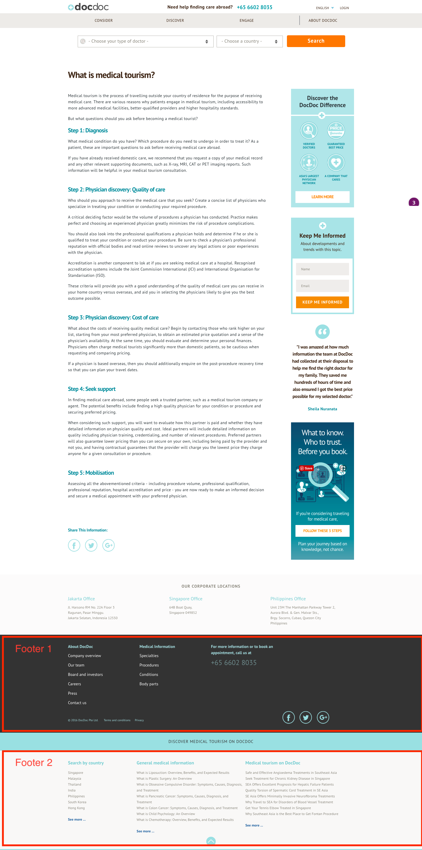
In addition, depending how you looked at it, the site had between two and three footers. The first lists all the company locations, which stakeholders listed in order to show trustworthiness and that this wasn’t an operation just being run out of someone’s basement. The second footer lists about pages (though not the one that’s in the first header) and also DocDoc’s own medical information pages. The third footer listed additional medical information.
When I spoke to the engineering team and our SEO consultant, they noted this additional information was there to bump up our page on search engines. However, this probably would have to be removed, as our new payment model meant that we needed to keep these medical information pages behind a paywall. I kept the addresses and the second footer. On consultation with our SEO consultant and in order to align with our new payment model, I removed the final footer.
Before and after of website footers
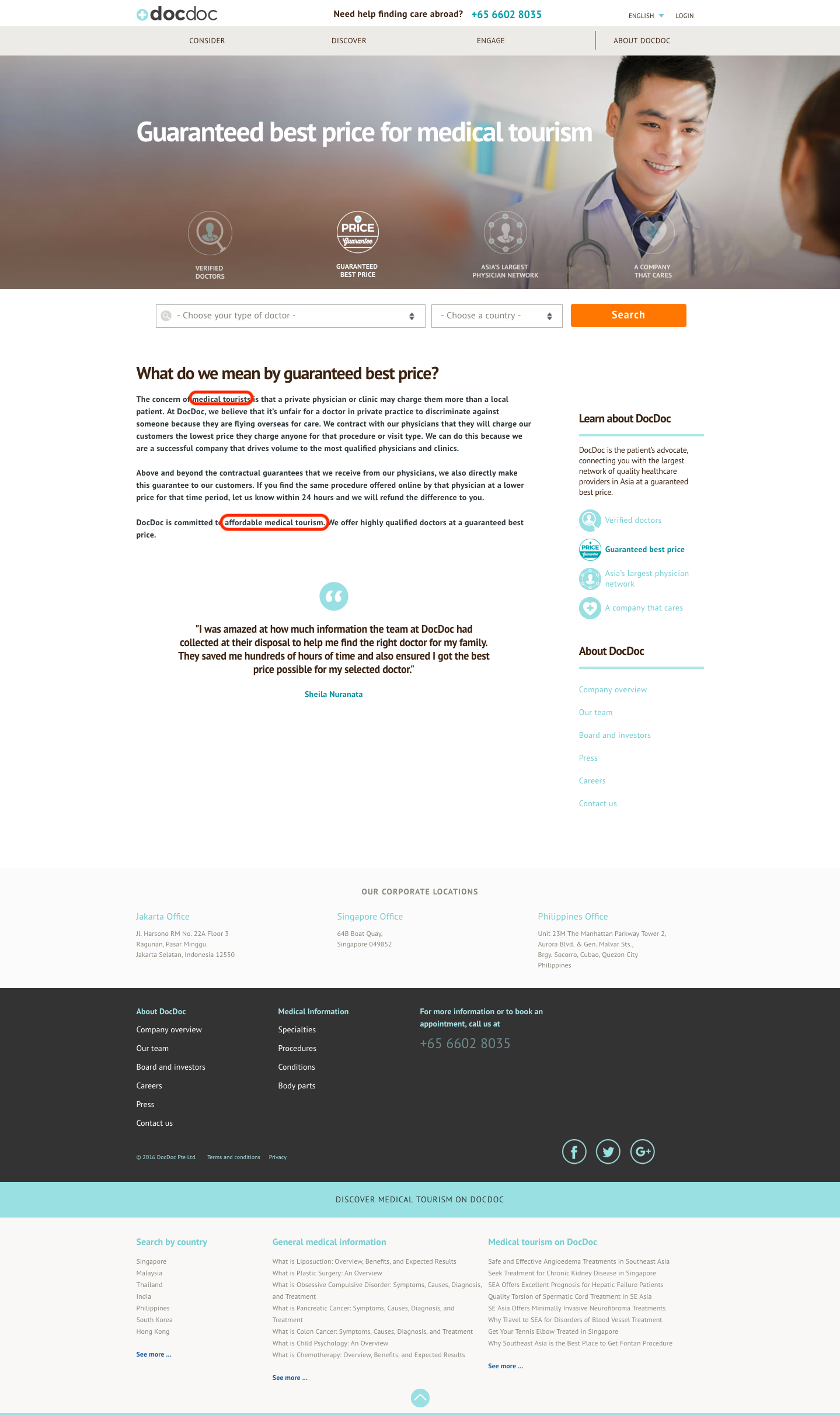
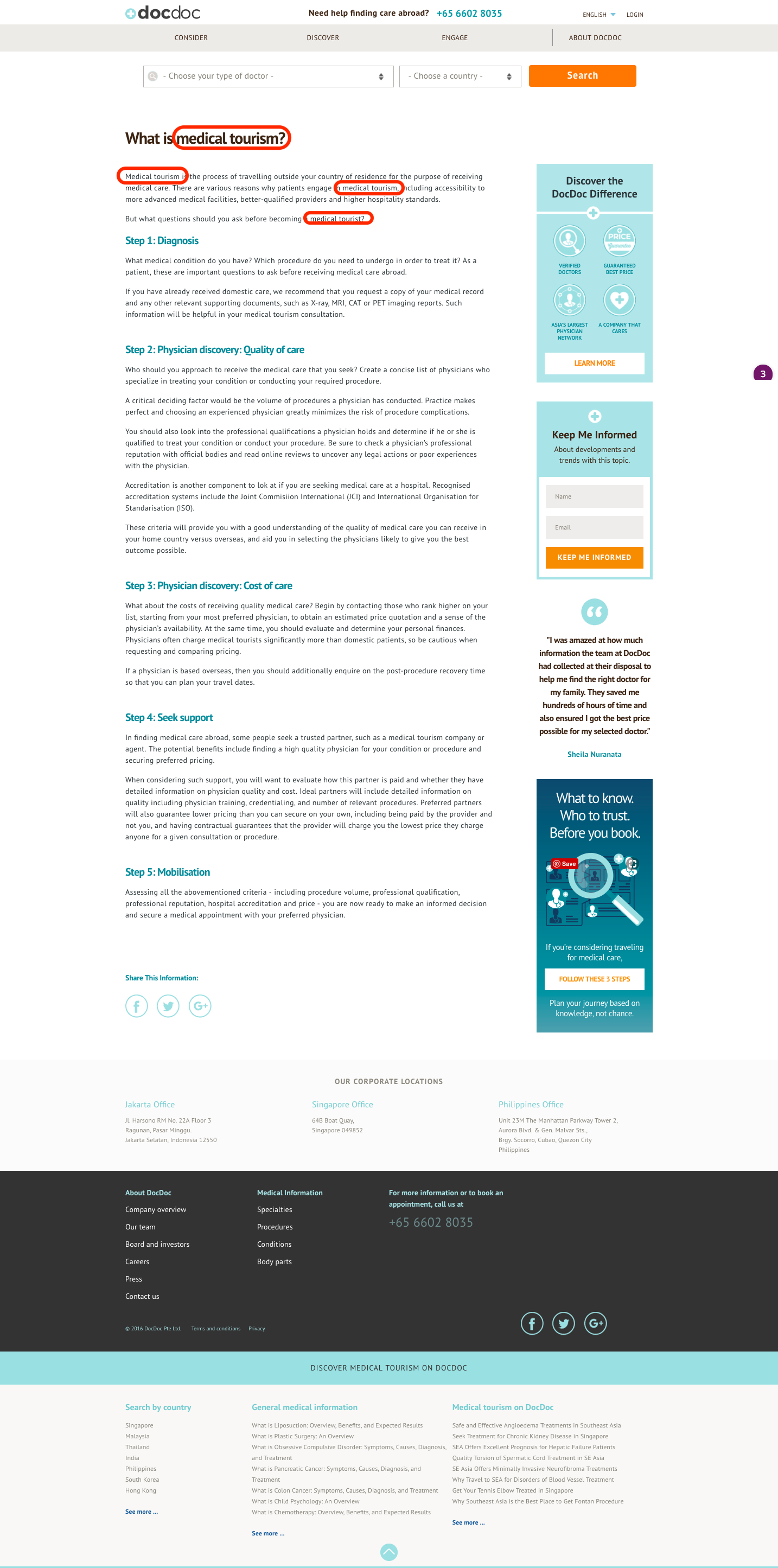
Refocused language
In addition to the header which was meant to funnel users to our medical tourism service, one of the value propositions was still medical tourism focused. Since we were pivoting to a doctor discovery focus, we decided to draft up a new value proposition in our brand guidelines about our descriptive and prescriptive algorithm.
In addition, I dug through the site to find the medical tourism pages to note which ones to remove for engineering.
Before and after of one of our value propositions
Final Prototype


Results
This was a good quick sprint to clean up the branding guidelines and the main website. We accomplished the goals that we wanted in the first place. The next biggest pain point to work on would be to allow for faster marketing publishing instead of uploading articles manually through engineering.
Overall, the revamped site:
Refocused our brand on our core doctor discovery services and also realigned it with our insurance based business model
Reflected a cleaner and more cohesive visual hierarchy